

Hello
Welcome to est.tech! This is the website for Ericsson Software Technology (EST), the open source development arm of Ericsson. Established in 2017, EST is a rather young organization when compared to the 150 years of history Ericsson has to date. But, where we lack in lineage, we make up for it with a fiery passion and the ability to quickly manoeuvre in research and development, building bridges across the open source community globally.
With such an important raison d'être, we recognize the necessity of having an accessible portal for opening discussions and acquiring a seat at the table. That portal takes the form of our website. Indeed, interested parties, individuals or organizations, would visit our website to learn more about EST, who we are, what we do, have done and will do, and how the missions and interests of EST can align with theirs. In short, having a medium to convey our message clearly is the root of all fruitful collaborations in the industry.
Getting Started
While the old EST site had its charms, the presentation layer left a bit of room for improvements. I was talking about this gap with Matthew Khouzam who then introduced me to Frank Kelly, the General Manager and Director of EST (according to Frank's Linkedin profile), and the team. And we got the ball rolling from there towards a new site. Like all good SDLC practices, we got started with a group chat with all involved people. Since I was proposing changes, it was fundamental to do some groundworks to fire off the discussions with mockups of how the site would look like. Then we defined some initial requirements and ideated possible solutions with qualitative target metrics we think make sense. So, the site needs:
-
To have a cohesive layout and theme
- reference Ericsson's branding and design cues
-
To be accessible:
- follow Web Content Accessibility Guidelines (WCAG) v2.2 as of development
- achieve > 90 score on Chrome Lighthouse Accessibility benchmark
-
To have improved user experience
- reduce perceived difficulty in navigation
- improve visual parsing of information
-
To be optimized for search engine
- achieve > 90 score on Chrome Lighthouse SEO benchmark
-
To overall follow website/web application best practices
- achieve > 95 score on Lighthouse Best Practices assessment
An obvious criterion excluded from the requirements above is Performance, because speed is subjective as it depends on a myriad of factors outside of our control, such as how good a user's or the server's internet connection is, how geographically far a user is from the server, optimization features are enabled on the different browsers or not, and so on. And these factors fluctuate during different time of the day, affecting the layout shift, time to first contentful paint, and total load time. Consequently, Performance is scoped out of the criteria, knowing that as long as we follow the other criteria, performance gain should optimally follow.
Development
With the target criteria defined, we took a step back and assess the current state of the site, noting down the existing page structure and the type and shapes of the content. I went over the database schema, read up on Wagtail, our CMS, and listed what editors actually rely on: pages, reusable snippets, streamfield blocks and the admin. That inventory set one ground rule for the project: the content model and the editing experience stay, and only the presentation layer gets replaced, so editors don't have to relearn anything and no existing content is lost.
The work landed in three waves: the overhaul itself, new content features (article authors, read time, view counts, tables, markdown and a "Flash" news format), and a round of polish driven by real content.
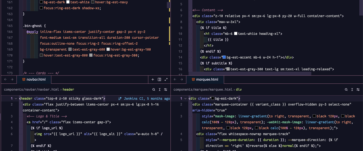
A cohesive theme
The old stylesheet was one hand-written file with no shared vocabulary, so each page handled spacing, cards and buttons a little differently, and the site read as several pages rather than one.
Palette
We replaced it with a small design system on Tailwind CSS 4, built on Ericsson Design System tokens. The palette is deliberately narrow with black, neutral grays and white, then using the blue accent to indicate interactive elements. We deliberately limit the spectrum of colors to maintain the site's ease of use to help readers avoid being bombarded with a myriad of colors which could make the UI feel cluttered and messy.
Typeface
The obvious choice for typeface is Ericsson Hilda. The industrty norm is using light-weight headings, which lets hierarchy come from size and weight contrast.
Components and Templates
The repeating pieces (buttons, cards, heroes, navigation, footer and search) became reusable django-components, so a fix to the card layout reaches every page that uses one. Scroll reveals add a little motion, and they switch off for anyone who prefers reduced motion. Then from the foundational components we constructed the layout templates.
As you notice, we have systematic approach, building out the smallest pieces to eventually reach a cohesive component and layout system.
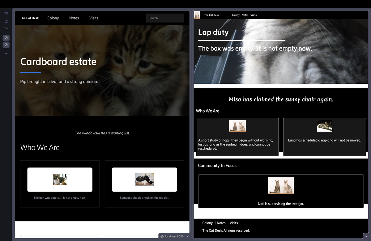
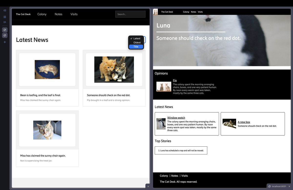
Comparison
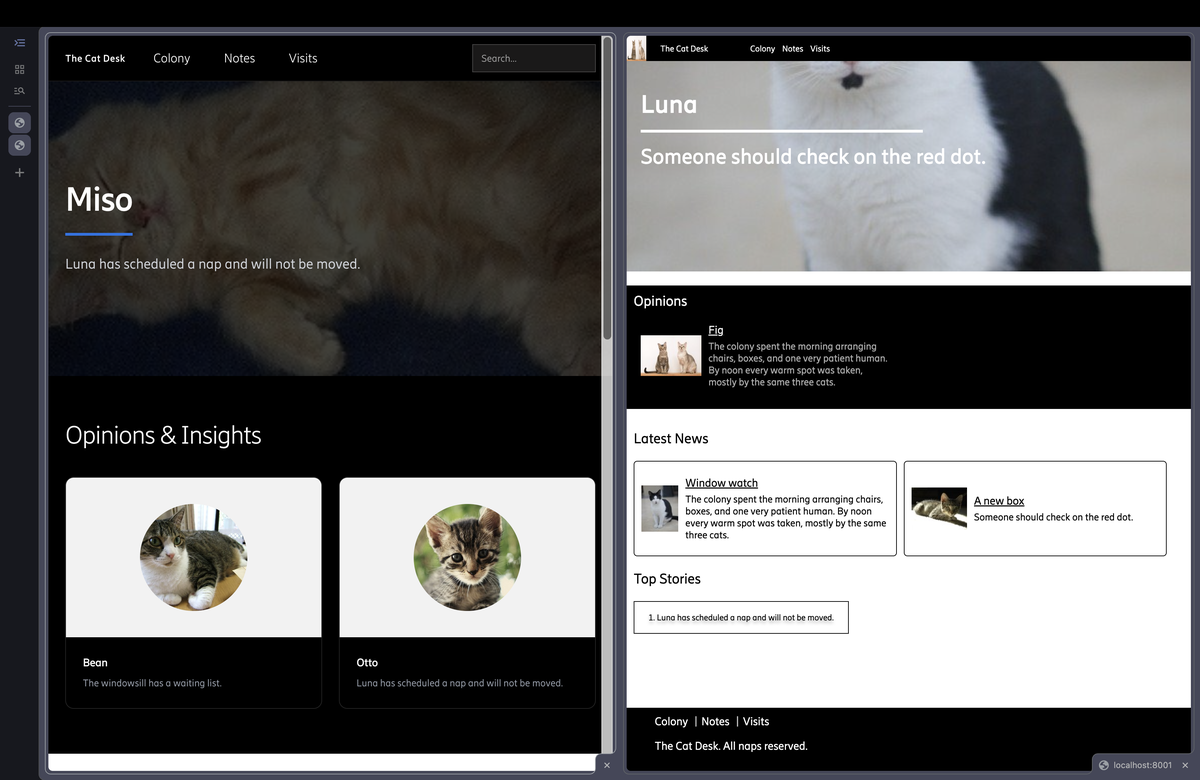
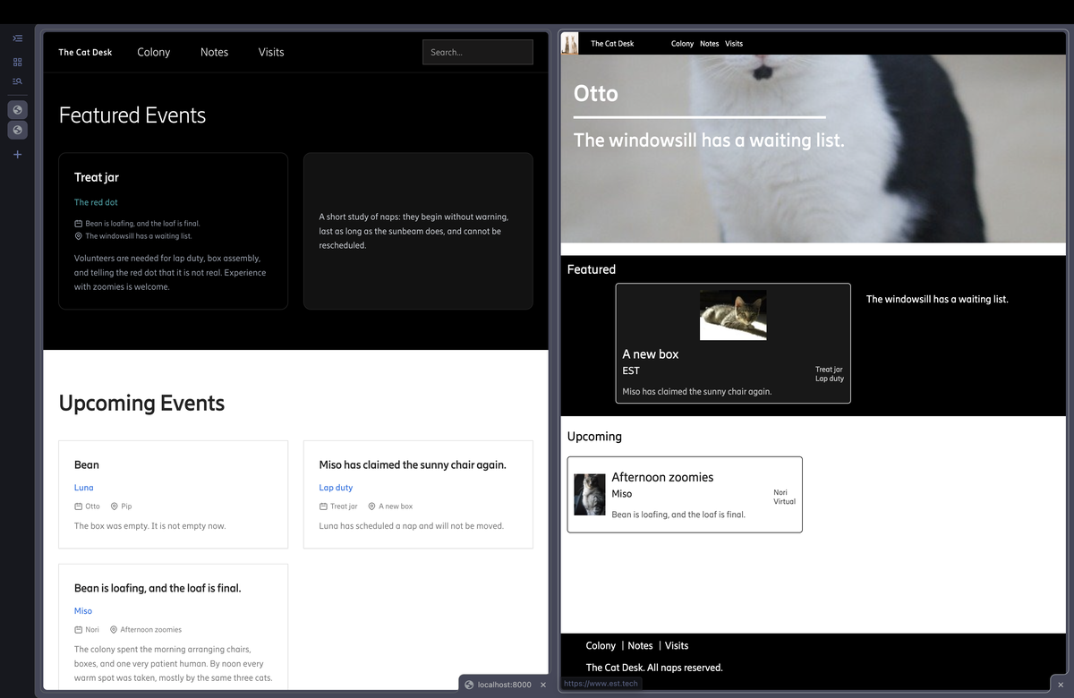
Here are some A/B screenshots of the new (left) and old (right) site side-by-side. Note that brand marks and logos and actual live content are replaced with cats.
- Homepage
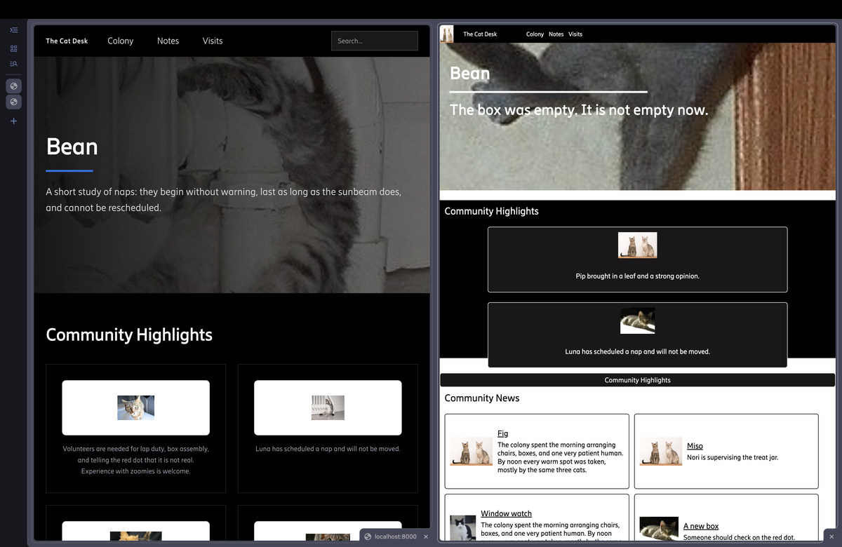
- Community page
- News page
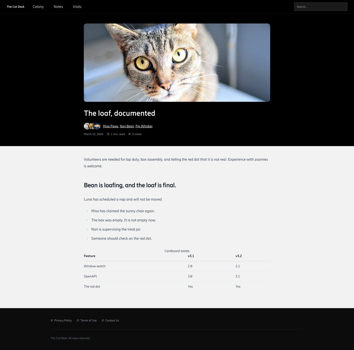
- Article page with rich metadata, view count, read time, and rich markdown content rendering
Search Engine Optimization
Initially, the old base template already used the SEO title when an author set one, generating a meta description from the page's search description, included a viewport tag, and served both robots.txt and sitemap.xml. Building from there, I added preview for embedded link sharing by generating Open Graph attributes. Finally, every page now also sends index, follow for robots.
The other search equation
A user might want to quickly get the information by a keyword that they are looking for, so the site is now integrated with a global content search. By having all the large pages: home, community, events, news and articles declare their search fields, bodies included, the words inside a piece are indexed rather than just its headline. The search view then walks the matching pages, pulls out the specific block that matched, and labels result according to its type. Results highlight the fuzzy-matched search query for the user to quickly parse through and are paginated to optimize UI performance.
Accessibility
Accessibility started with structure. Pages use real landmarks (header, nav, main and footer) and labelled search forms, so screen reader users can jump between regions instead of tabbing through everything. Interactive details follow from that: icon-only controls carry an aria-label, the mobile menu reports its state through aria-expanded, Escape closes search, and every interactive element shows a visible keyboard focus.
Some of the work belongs to editors rather than templates. Alt text is an editable field on every image block, so the people who know what an image shows are the ones who describe it. Motion and contrast got the same attention: reduced-motion users get static content, and card logos sit on a light plate because transparent marks were unreadable on dark backgrounds.
Best practices
Configuration now comes from environment variables instead of hard-coded values, which lets the same code run locally, in staging and behind the production proxy. To make that easy to try, a Docker dev setup and a seed_site command give anyone a working copy with sample content, so reviewers don't need production data. On the content side, structured table and markdown blocks replace pasted HTML, and code samples are highlighted on the server, which keeps article markup consistent and avoids shipping a client-side highlighter.
Results
Lighthouse results on a local build with seeded content, across home, community, news, events and an article:
| Category | Target | New site |
|---|---|---|
| Accessibility | > 90 | 94–95 |
| SEO | > 90 | 91–92 |
| Best Practices | > 95 | 96 |
All three targets pass on every page we tested. Beyond the scores, the site now looks consistent from page to page, search jumps straight to the block that matched, articles carry richer metadata, and editors kept the admin they already knew.
Lessons
The most useful decision was writing down what "better" meant before designing anything. With concrete targets such as WCAG 2.2 and Lighthouse thresholds, arguments about taste became checks we could run. Showing a mockup of the new homepage did the same for stakeholders, and it earned a faster yes than any proposal would have.
The biggest surprise came from real content. Placeholder text and images looked fine, but real logos, photos and long titles exposed problems such as transparent logos on dark cards and images that were too small or too large, and most of the final wave was fixing those. The better fix was usually a control for editors, like image size options and alt text fields, rather than a special case in code. The component library paid off the same way: fixing a card once fixed it everywhere.
What is next
While the overhaul effects have been quite substantial so far, we continuously think of ways to elevate the site and more features baking in the oven to come. We welcome feedbacks of all shapes and sizes, internally or externally, to help improve the site and better serve information to our community.
Acknowledgement
I would like to thank Matthew, Frank, Robert, and Vinnie for giving me the opportunity to contribute to EST, for collaborating and helping with getting the new site up and running.
About the author
Anh Nguyen is a Software Development intern at Ericsson Canada as of this article. Anh develops full stack apps, security compliance tools and platforms.